A few months ago, my team and I were in the IA phase of a project and were getting ramped up to create some user flows. User flows have always been a valuable part of eHouse’s preliminary process and we write them into contracts as client deliverables. In the past, our user flows have consisted of the traditional shapes (squares, diamonds, squares with wavy edges, etc.) that are strategically connected together to represent the user’s experience through a specific process. We spend a lot of time researching best practices and working out the challenges to develop the best possible solutions for these experiences.
So, our user flows contained strong content, but accounting for seemingly countless scenarios and including informative annotations was making them difficult to understand. We realized that we were in need of a cleaner, clearer presentation style.
This revelation hit us just in time to implement a new approach on the upcoming flows and, in doing so, we realized some key benefits going forward.
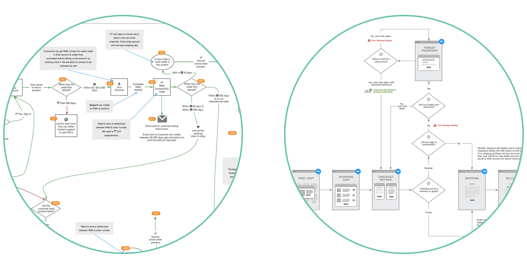
Old Approach to User Flows (left) compared to New Approach (right)
1. Visual cues clarify meaning.
The labeled page icons were easier to decipher than the basic square we were previously using. While these icons are simple, they provide just enough information to offer subtle visual cues that help clear up some common confusion. For instance, showing form fields on a page icon lets the viewer understand that information is being submitted and that is why those pages are often followed by error and success routes. You can hint at the elements that will exist on the various kinds of pages without distracting from the purpose of the flow - understanding the experience. Keeping these icons simple, by using a grayscale color scheme and very basic shapes, allowed us to relay a generic look of the page without committing to any kind of design decisions this early in the process. They simply aid in the visualization of the process.
2. Focus on the content.
With a more legible style and layout, it’s easier for clients to focus on and digest the content of the user flows. After all, the solutions are what really matter and it would be a mistake to run the risk of that content getting lost or misinterpreted because of poor visual presentation. It allows us, internally, to also have a clearer understanding of the flows and thus be more confident in the deliverables we’re presenting.
3. Extend the process.
As I’ve already mentioned, user flows are a part of our projects’ process. Collecting an internal library of these icons is allowing us to reuse them on every user flow moving forward, saving us time while maintaining a consistent style. Their simple style makes them easy to build on as we need various new pages. We’ve created our icons in Illustrator and imported the into Omnigraffle as a stencil set, allowing us to resize and edit labels as we see fit.
![]()