eCommerce subscriptions continue to grow by leaps and bounds – it’s estimated that subscription sales increased by 41% in 2020 and that 2021 eCommerce subscription revenue was $10 billion higher than in 2019.
We love subscriptions. They can be a win-win for both customers and brands. Customers save time and effort, and brands gain a steady and more predictable revenue stream.
However, not all subscription experiences are created equal. If the experience of managing a subscription is too cumbersome, customers will churn. Even if you’re not seeing red flags (e.g., high churn rate), it’s likely you can still make tweaks to make your subscription management experience even better.
Fortunately, there are some clear best practices to follow that will help improve the subscription management experience for your customers. A great experience may even compel them to spend more!
To improve your subscription management experience, there are two primary goals: 1) make it easy for customers to find frequently sought information and 2) simplify management for customers by enabling convenient self-service.
Why bother? Supporting customers in this way strengthens customers’ relationship with your brand, which in turn increases customer retention, can increase average order value (AOV), and ultimately boosts customer lifetime value (LTV).
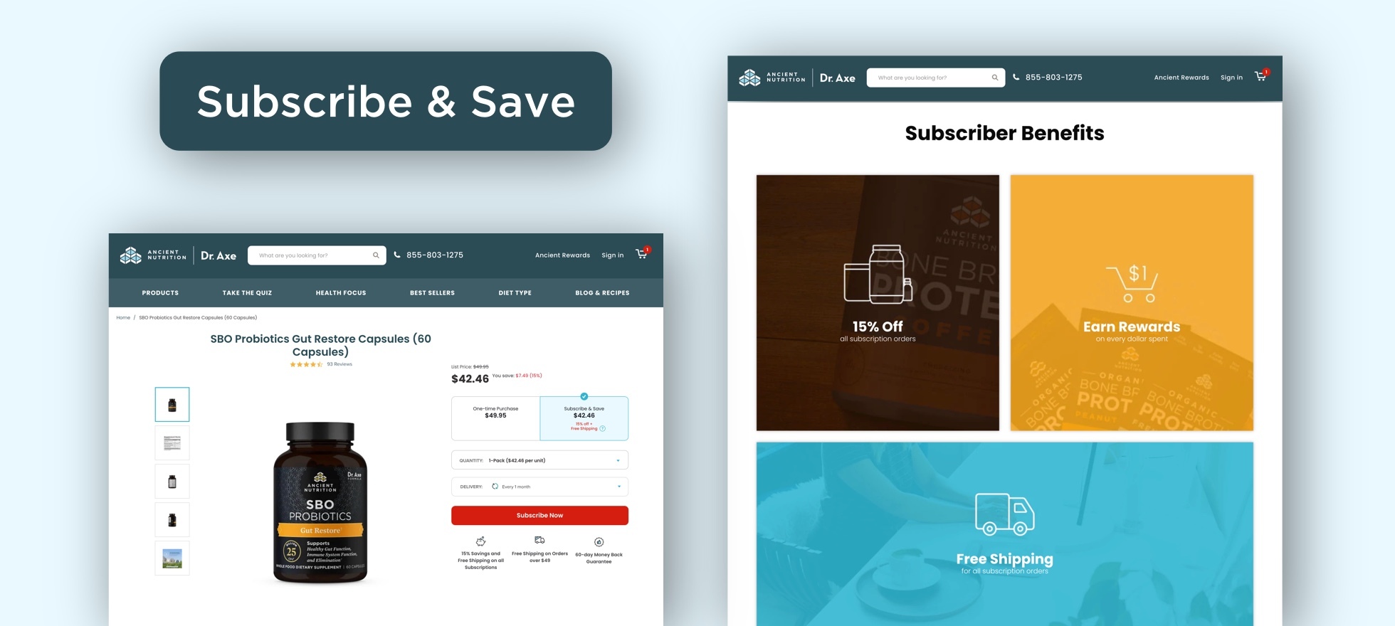
Guideline #1: Ensure the subscription experience aligns with your brand experience
When customers engage with your subscription program, it shouldn’t be like they’re entering a different world (we see similar issues with order tracking). The subscription management experience should be a seamless extension of the overall account experience.
To achieve this, consolidate your varied account platform interfaces (i.e., Shopify and Recharge) into a single cohesive UI so that the customer doesn’t feel disoriented when navigating between different areas of their account.
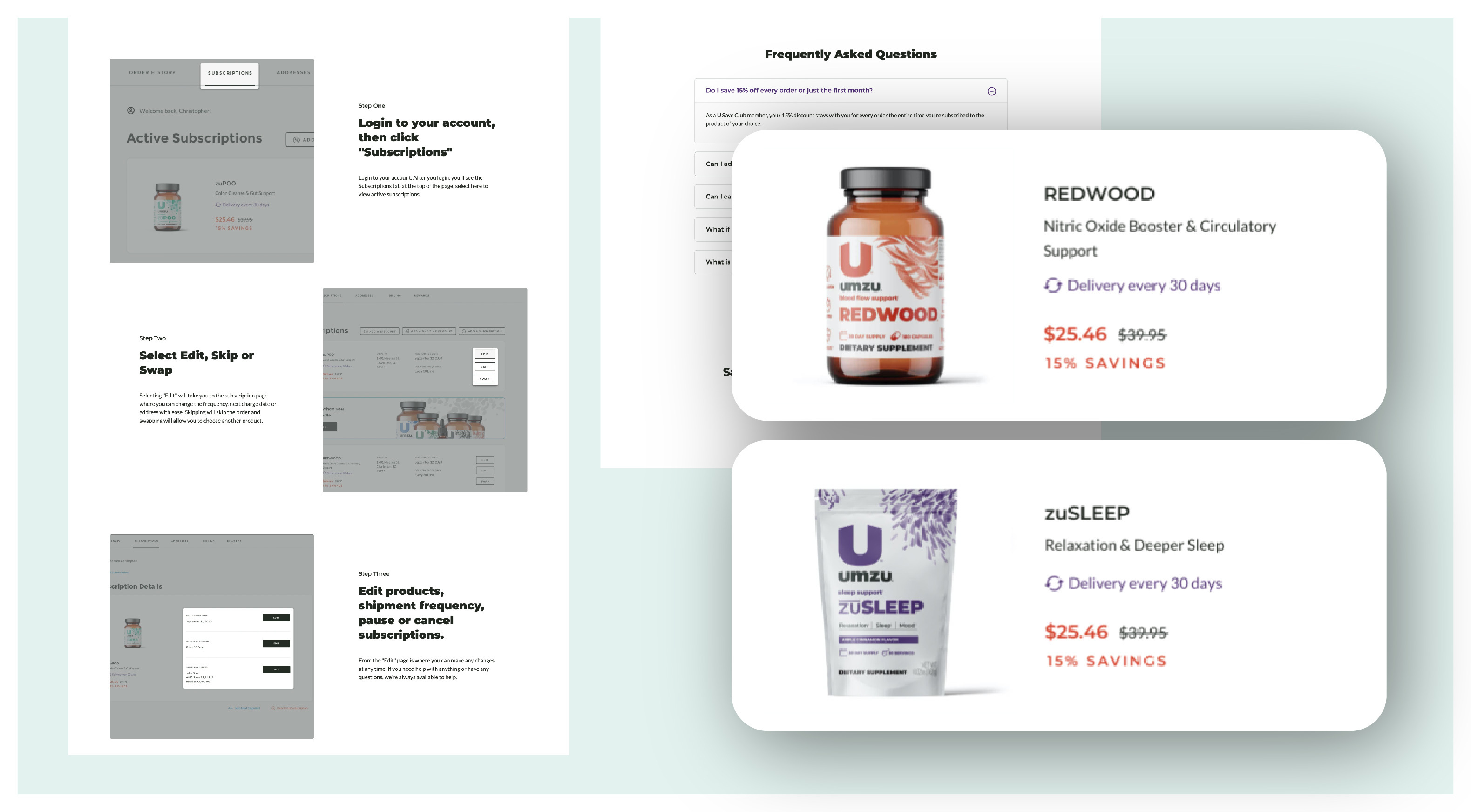
Guideline #2: Clearly present key subscription information
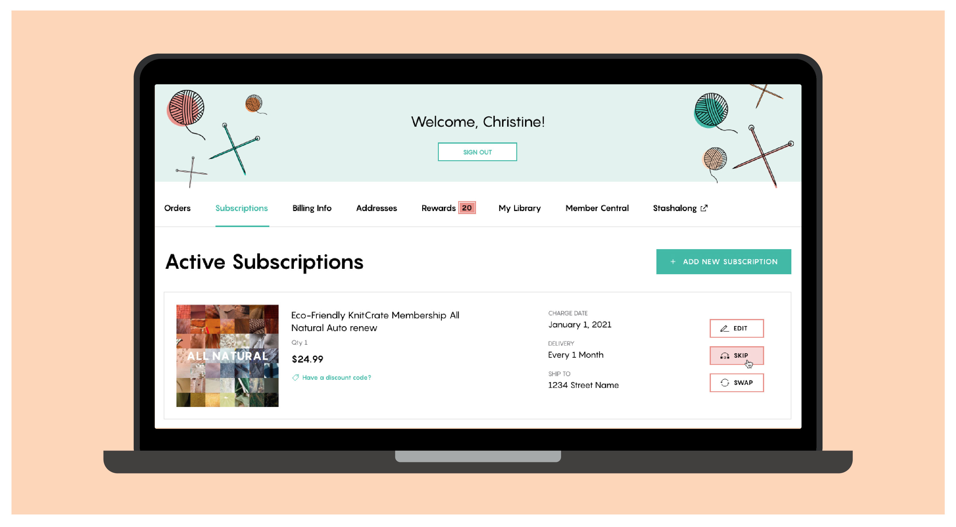
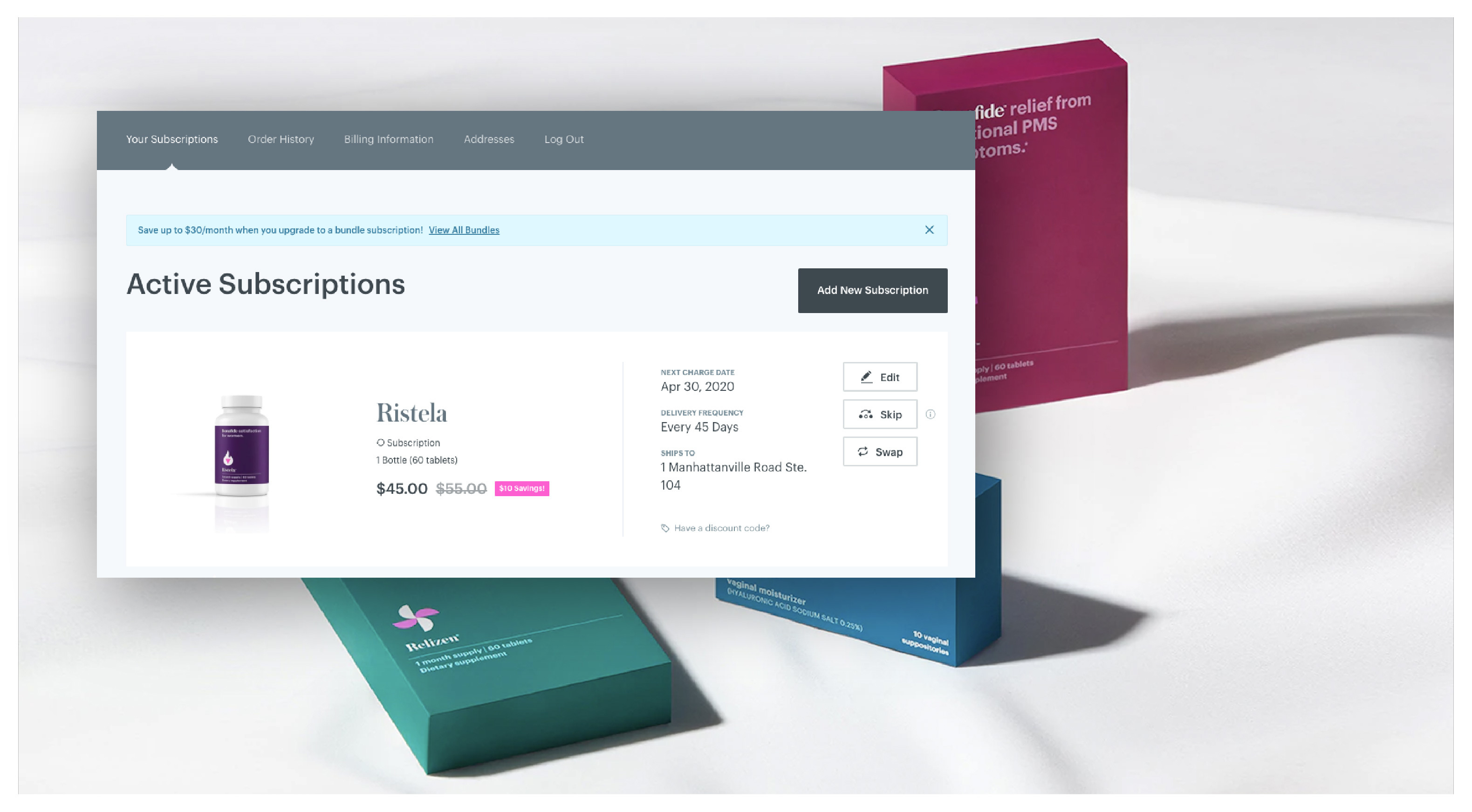
There is definitely a right way and a wrong way to display subscription information for customers. Let’s review the right way. First, it’s essential that active subscriptions should display according to the next order date (e.g., soonest to latest).
Also, present information about a customer’s active subscriptions in an organized, simplified way that includes all pertinent details, including:
- Product image
- Product title
- Variant details, if applicable (e.g., color, flavor, size)
- Quantity
- Price
- Next order date
- Delivery frequency
- Shipping address
And, don’t forget the visuals. Product images for what’s included in each subscription make it easy for customers to quickly identify and differentiate between their subscriptions.
Guideline #3: Make it easy for the customer to make changes to their subscription
While you may wish all your subscription customers would just set it, forget it, and stay satisfied, life isn’t always steady like that. Our tastes change, we go on vacation, or something unpredictable happens. Making it difficult for customers to edit their subscription preferences, quantities, delivery frequency, etc. makes it more likely they will get frustrated and unsubscribe.
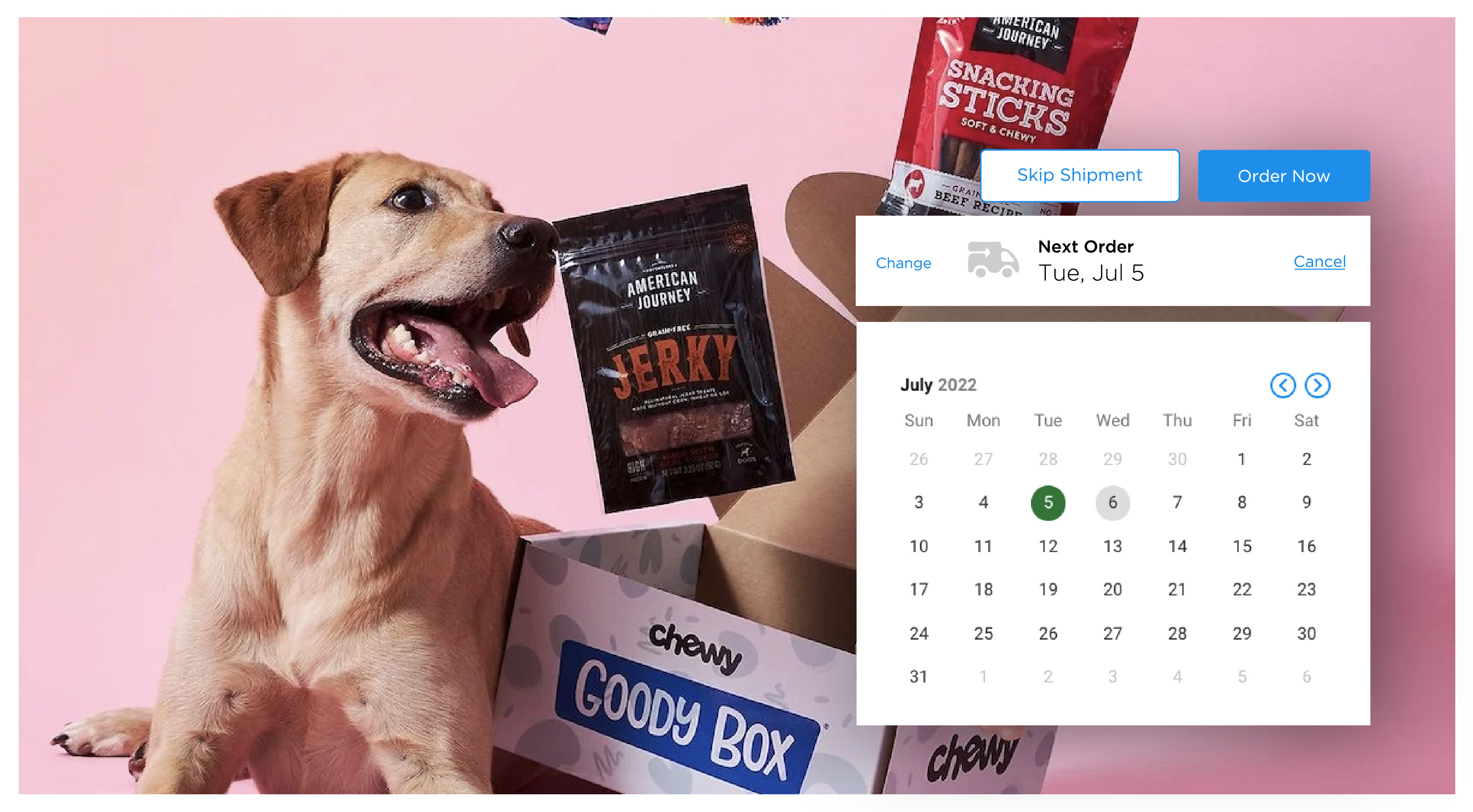
Instead, a good subscription management experience hinges on giving customers options and the ability to make changes. For example, to delay or expedite their next subscription delivery, or change or add products. The more flexibility you can provide, the better you’ll fit into their life’s ups and downs, and the longer they’re likely to stay with you.
Some essential UI features to include:
- Clear indication of next order date with the ability to quickly and easily edit or skip
- “Next order date” is visually prominent and easy to find at quick glance
- Visually prominent CTA to skip their next shipment
- Visually prominent CTA to “order now”
- Use a date picker when editing the next order date; customers can more easily identify dates in accordance with the day of the week
Guideline #4: Be sure to highlight the subscription value
In addition to convenience, a key reason customers sign up for subscriptions is the cost savings. However, as we all know, memory is unreliable! Over time, customers may forget that they’re getting a discount and feel less strongly about the value the subscription is bringing them.
Therefore, it’s a good practice to remind them by highlighting the price savings within the subscription listing of their account. This helps ensure that the value of every shipment is reinforced every time the customer logs into their account.
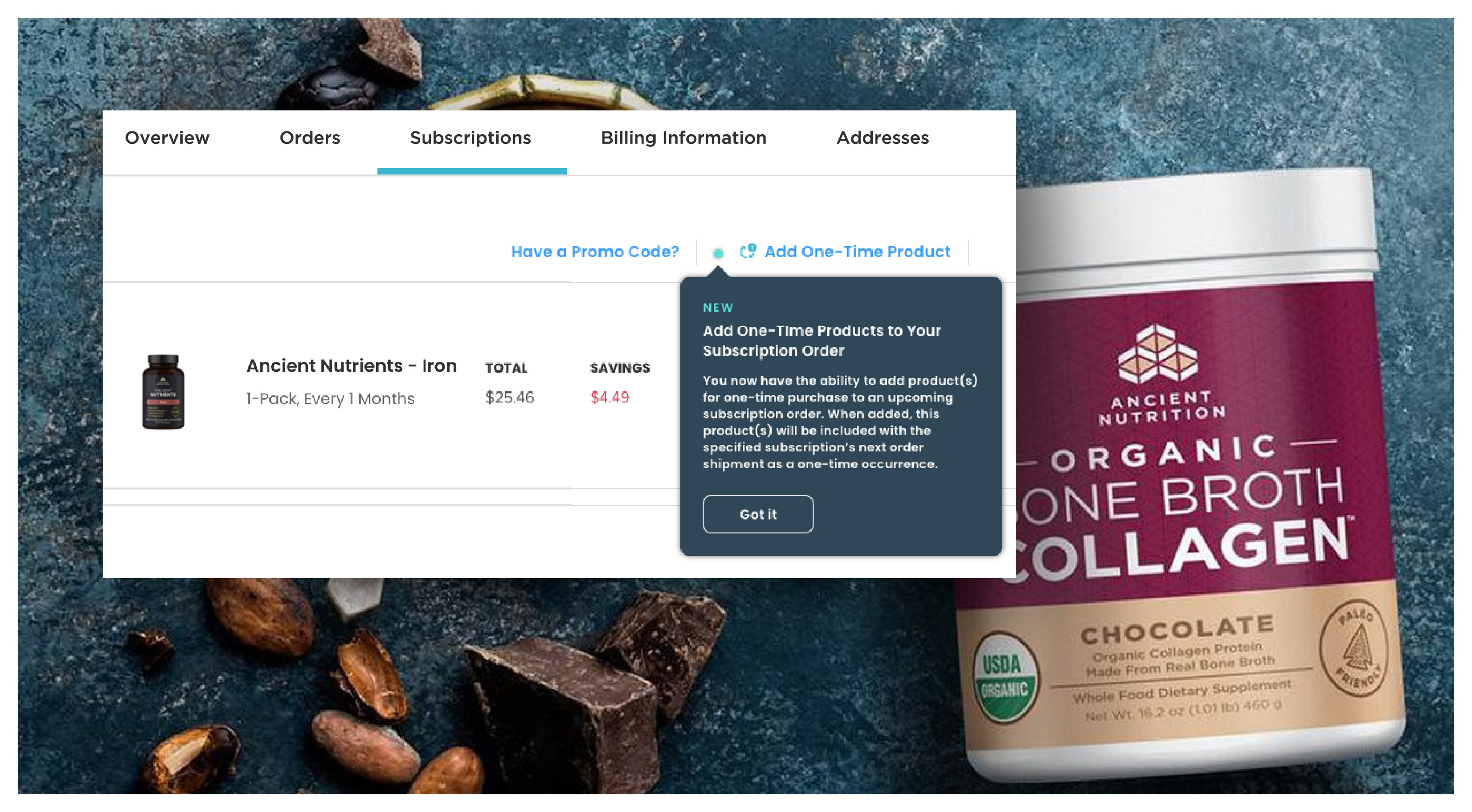
Guideline #5: Enable add-ons
Increasing average order value (AOV) is a no-brainer to increase your bottom line. Why not for subscriptions too? Enabling customers to add one-time products to their upcoming subscription allows them to try new products, flavors, or related accessories without the hassle of having to go through the checkout process. No extra form-filling or reaching for their credit card – you’ve made it that simple for them to spend more.
If you do enable this feature, make sure customers know about it. Consider promoting relevant one-time product pairings in an upcoming shipment email (e.g., “You have an upcoming subscription shipment of dog food. Reward your pup when you tack on dog treats as a one-time add-on to this shipment.”). And/or add a message/popup to the account page to highlight this new option.
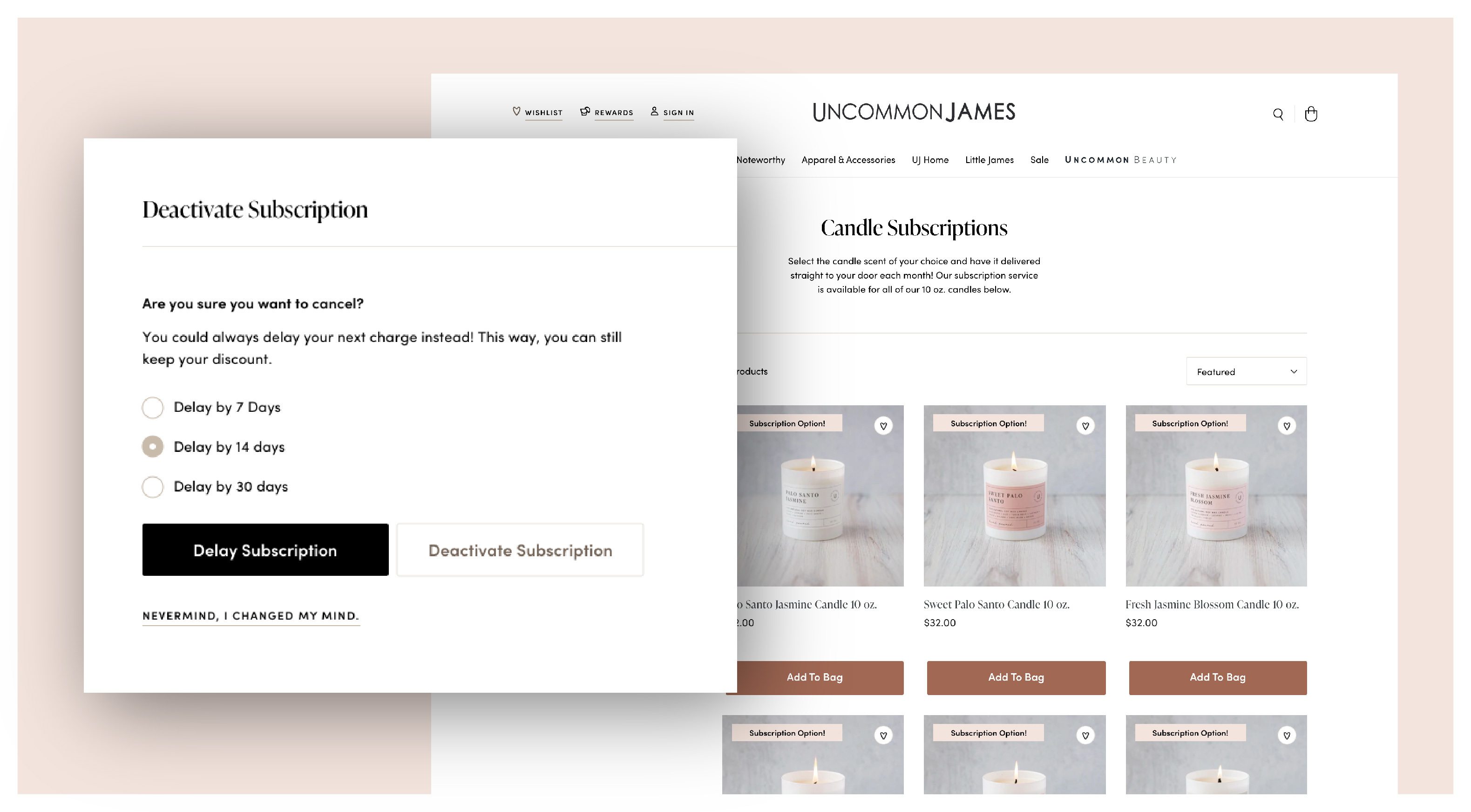
Guideline #6: Help, don’t hinder customers
While it may seem counterintuitive, don’t make it too difficult for customers to cancel their subscription. Making them go through hoops only leads to major frustration and risks losing that customer forever.
Instead, a best practice is to set up an automated retention flow to offer options other than canceling. For example, when they click “cancel,” ask why they want to cancel. Then, when they select “I have too much product,” you can respond with “Would you rather delay your subscription?” This may ultimately be a better option for them – a win-win!
However, don’t make the flow too long. If a customer wants to cancel, make it easy to do so. Be sure you use friendly language so that the relationship ends (at least in the short term!) on a good note. You never know – they may want to re-subscribe in the future. Therefore, also make sure churning customers know they can come back anytime and it’s easy to rejoin.
In addition, you can turn some of those “lemons” into lemonade. When customers cancel, use this opportunity to ask how you can improve – they may provide you with information that will help you better optimize your program and experience.
Some key UI features to include:
- It doesn’t have to be front and center but include a clear CTA on the “edit subscription” view
- When a customer does go to cancel, use a simple/quick retention flow to get feedback as to why they want to cancel
Conclusion
If it makes sense for your products or services, eCommerce subscriptions can be a huge win for your brand. However, customer experience matters, and there are a lot of factors to consider to make your subscription program successful. To help you review your existing subscription management experience, or to plan for a new program, we’ve created a handy Subscription Management Experience Checklist (see below). If you need more guidance or want to talk eCommerce subscription strategy, give us a ring.
Get the downloadable 'Subscription Management Experience Checklist'
These best practices are based on eHouse's collective subscription experience and expertise.